Introduction
官网:https://github.com/teunbrand/ggh4x/
ggh4x 包是 ggplot2 扩展包。它提供了一些实用函数,虽然这些函数并不完全符合“图形语法”的概念(它们可能有点hacky),但在调整ggplot绘图结果时仍然很有用。比如调整facet的大小、将多种美学映射到颜色以及指定facet的单独比例等等,下面介绍一些常用的功能:
可以从 CRAN 安装最新稳定版本的 ggh4x,如下所示:
1
|
install.packages("ggh4x")
|
或者可以使用以下命令从 GitHub 安装开发版本:
1
2
|
# install.packages("devtools")
devtools::install_github("teunbrand/ggh4x")
|
调整facets
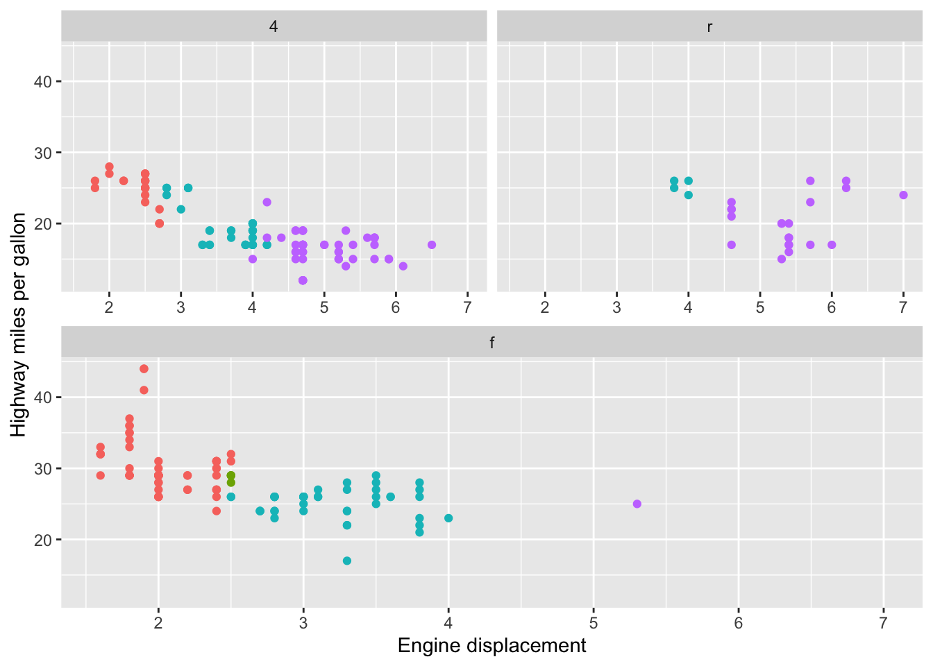
扩展facets
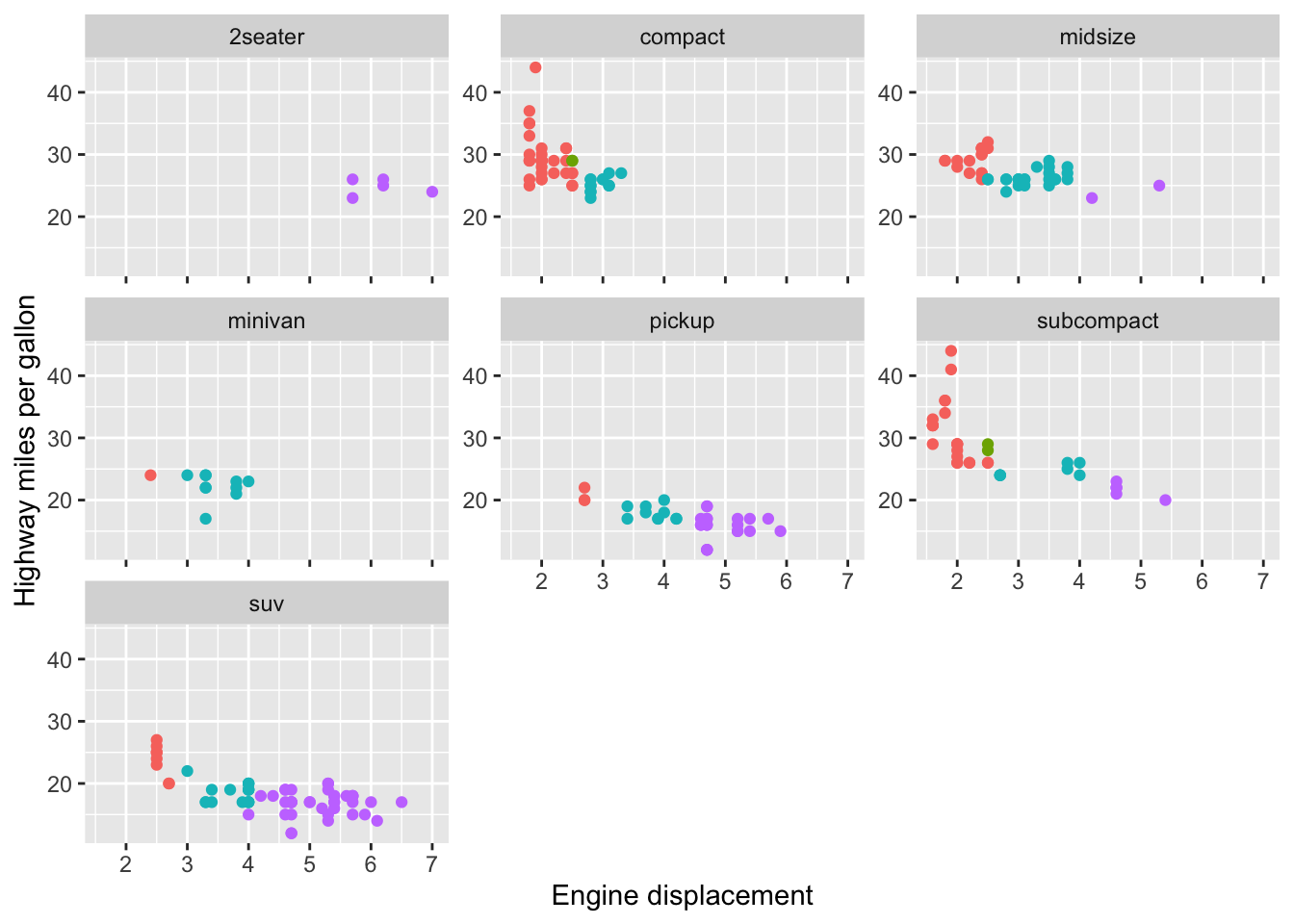
facet_wrap2和facet_grid2函数扩展了ggplot2的分面功能。即使当scales=“fixed”(默认)时,也可以使用axes参数在(部分或全部)内面绘制轴。此外,可以选择省略轴标签,但通过设置remove_labels参数保留内部面的轴刻度。
1
2
3
4
5
6
7
8
|
library(ggh4x)
library(scales)
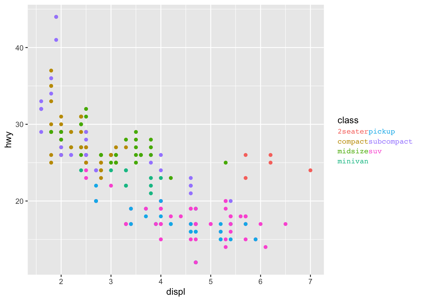
p <- ggplot(mpg, aes(displ, hwy, colour = as.factor(cyl))) + geom_point() +
labs(x = "Engine displacement", y = "Highway miles per gallon") +
guides(colour = "none")
p + facet_wrap2(vars(class), axes = "all", remove_labels = "x")
|
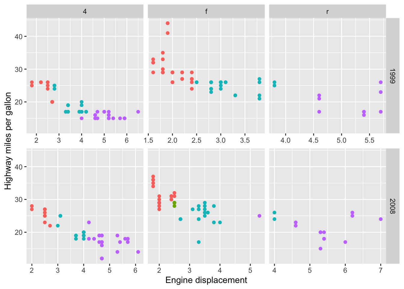
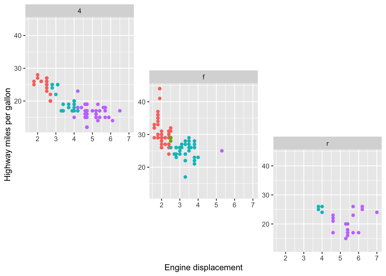
此外,facet_grid2() 还支持该包所谓的“独立”尺度。这缓解了 ggplot2::facet_grid() 的限制,即比例只能在布局的行和列之间自由,而允许比例在布局的行和列内自由。这保留了网格布局,但保留了包裹面中尺度的灵活性。请注意,在下图中,每个面板的 x 轴都是独立的。
1
|
p + facet_grid2(vars(year), vars(drv), scales = "free_x", independent = "x")
|
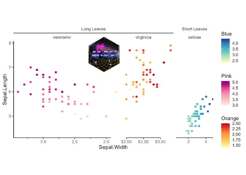
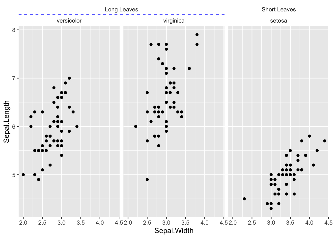
嵌套facets
ggh4x这个包因生成嵌套面而闻名;其中,如果外strip属于同一类别,则它们可以跨越内strip。
如果分面存在一些层次关系,这可能特别有用。
在下面的示例中,根据叶子的长短对鸢尾花进行分类:
 1
 2
 3
 4
 5
 6
 7
 8
 9
10
11
12
|
new_iris <- transform(
  iris,
  Nester = ifelse(Species == "setosa", "Short Leaves", "Long Leaves")
)

iris_plot <- ggplot(new_iris, aes(Sepal.Width, Sepal.Length)) +
  geom_point()

iris_plot +
  facet_nested(~ Nester + Species, nest_line = element_line(linetype = 2)) +
  theme(strip.background = element_blank(),
        ggh4x.facet.nestline = element_line(colour = "blue"))
|
手动设计facets
为了实现对 ggplot2 方面的类似base-R的par(mar = c(2,2,1,1))控制级别,facet_manual() 被引入。与layout()函数一样,facet_manual()需要预先指定哪些面板放置在哪里。
这些被称为“手动”构面,因为它不会像网格和环绕构面那样根据可用数据动态生成布局。在上图中赋予layout()函数的矩阵现在可以用作手动方面的设计参数。
1
2
3
|
# Setting up a design for a layout
design <- matrix(c(1,2,3,2), 2, 2)
p + facet_manual(vars(factor(drv)), design = design)
|
或者更灵活的设计:
1
2
3
4
5
6
7
|
design <- "
  A##
  AB#
  #BC
  ##C
"
p + facet_manual(vars(drv), design = design)
|
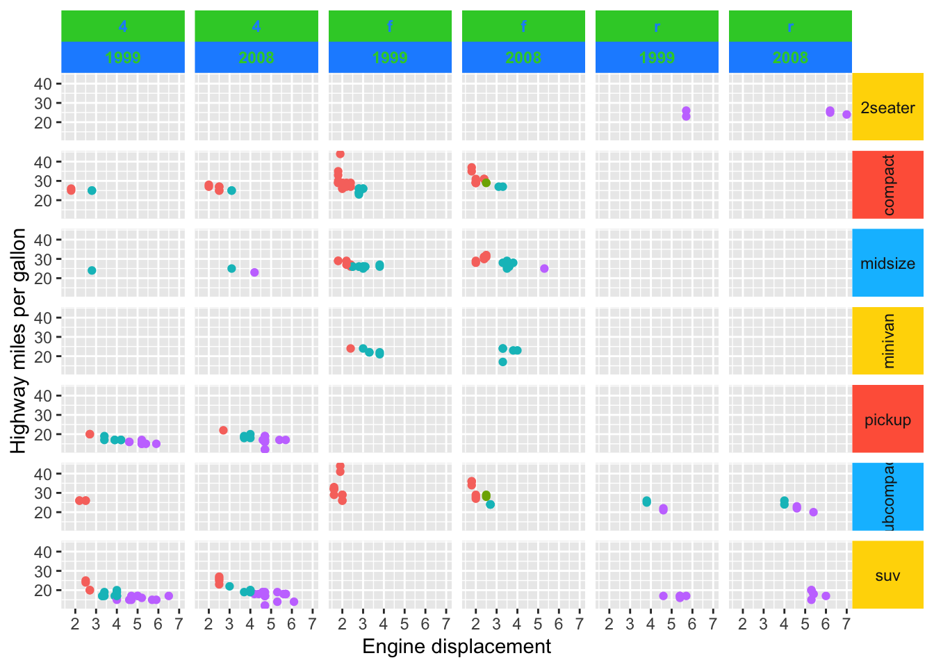
细调strips
ggh4x提供了主题化的 strips。这些 strips 还允许你根据每个标签或每层图形设置 strip.text.* 和 strip.background.* 的主题选项。background_x/y 和 text_x/y 参数可以接受一个包含 ggplot2 主题元素的列表。如果主题元素的数量与 strips 的数量不匹配,这些主题元素会使用 rep_len() 扩展,如下面的垂直 strips 所示。
按照如下方式构建一个元素列表可能会有点麻烦:list(element_text(colour = "dodgerblue", face = "bold"), element_text(colour = "limegreen", face = "bold"))。为了简化操作,可以使用方便的函数来获得相同的结果,像这样:elem_list_text(colour = c("dodgerblue", "limegreen"), face = c("bold", "bold")),这稍微简洁了一些。同样,也有 elem_list_rect() 函数可以对 element_rect() 执行类似操作。
 1
 2
 3
 4
 5
 6
 7
 8
 9
10
11
12
13
14
15
|
ridiculous_strips <- strip_themed(
     # Horizontal strips
     background_x = elem_list_rect(fill = c("limegreen", "dodgerblue")),
     text_x = elem_list_text(colour = c("dodgerblue", "limegreen"),
                             face = c("bold", "bold")),
     by_layer_x = TRUE,
     # Vertical strips
     background_y = elem_list_rect(
       fill = c("gold", "tomato", "deepskyblue")
     ),
     text_y = elem_list_text(angle = c(0, 90)),
     by_layer_y = FALSE
)

p + facet_grid2(class ~ drv + year, strip = ridiculous_strips)
|
调整scales
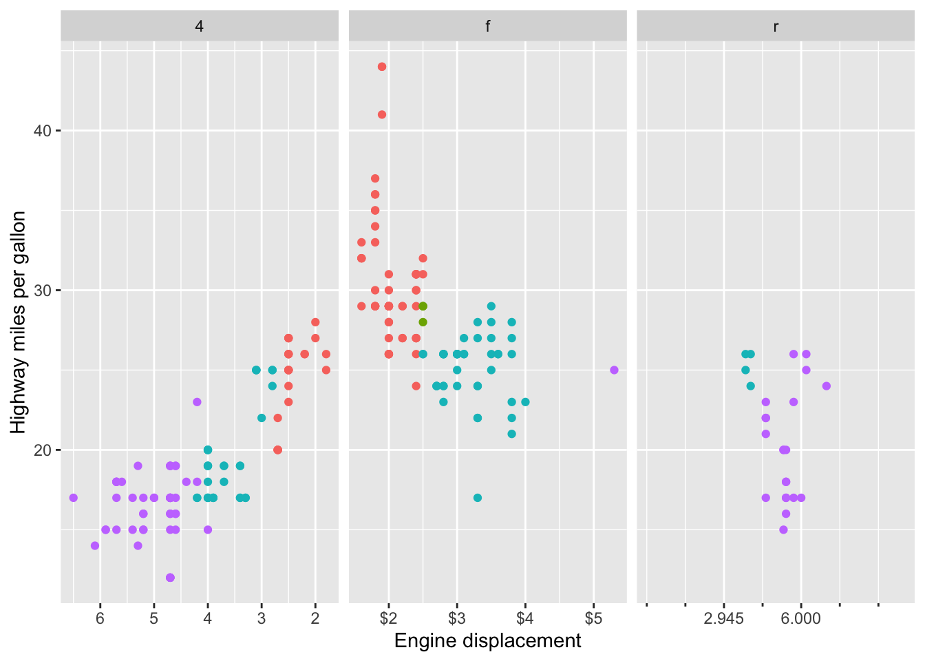
我们可能还希望对每个分面的坐标轴位置进行精确调整。为此,可以使用 facetted_pos_scales() 并结合 scales 列表来单独设置各个分面的刻度。通过这种方式可以为每个面板单独调整labels, breaks, limits, transformations,甚至轴guides。
scales 列表按照分面的顺序排列,只要它们被设置为 “free”(自由缩放)。调整位置刻度适用于多种类型的分面,如 wrap、grid 和 nested,但需要在添加分面之后调用。如果不想让坐标轴自由缩放,可以使用 xlim() 和 ylim() 来固定坐标范围。不过,facetted_pos_scales() 函数要求分面的 scales 参数必须设置为 “free”,才能应用不同的刻度设置。
 1
 2
 3
 4
 5
 6
 7
 8
 9
10
11
|
scales <- list(
  scale_x_reverse(),
  scale_x_continuous(labels = scales::dollar,
                     minor_breaks = c(2.5, 4.5)),
  scale_x_continuous(breaks = c(2.945, 6),
                     limits = c(0, 10),
                     guide = "axis_minor")
)

p + facet_wrap(vars(drv), scales = "free_x") +
  facetted_pos_scales(x = scales)
|
Panel大小
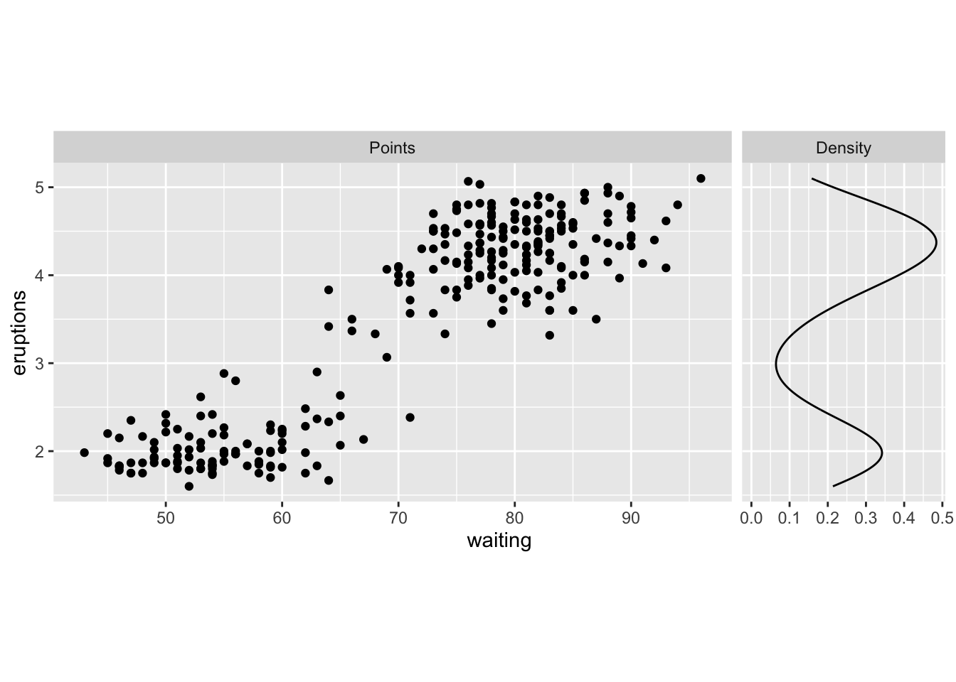
最后,我们还可以根据需要设置面板的大小。force_panelsizes() 函数允许你为行和列设置相对或绝对大小。该函数适用于遵循典型 ggplot2 规范的分面功能。这不仅包括 ggplot2 中的分面函数,还包括 ggforce 包中的函数、ggh4x 中的分面功能,甚至其他可能的包(但对 facet_manual() 来说是多余的)。值得注意的是,这个函数同样适用于 facet_null(),即每个图形的默认分面设置。
1
2
3
4
5
6
7
8
9
|
lvls <- factor(c("Points", "Density"), c("Points", "Density"))
g <- ggplot(faithful) +
  geom_point(aes(waiting, eruptions),
             data = ~ cbind(.x, facet = lvls[1])) +
  geom_density(aes(y = eruptions),
               data = ~ cbind(faithful, facet = lvls[2])) +
  facet_grid(~ facet, scales = "free_x")

g + force_panelsizes(cols = c(1, 0.3), rows = c(0.5), respect = TRUE)
|
调整legend
多color scale
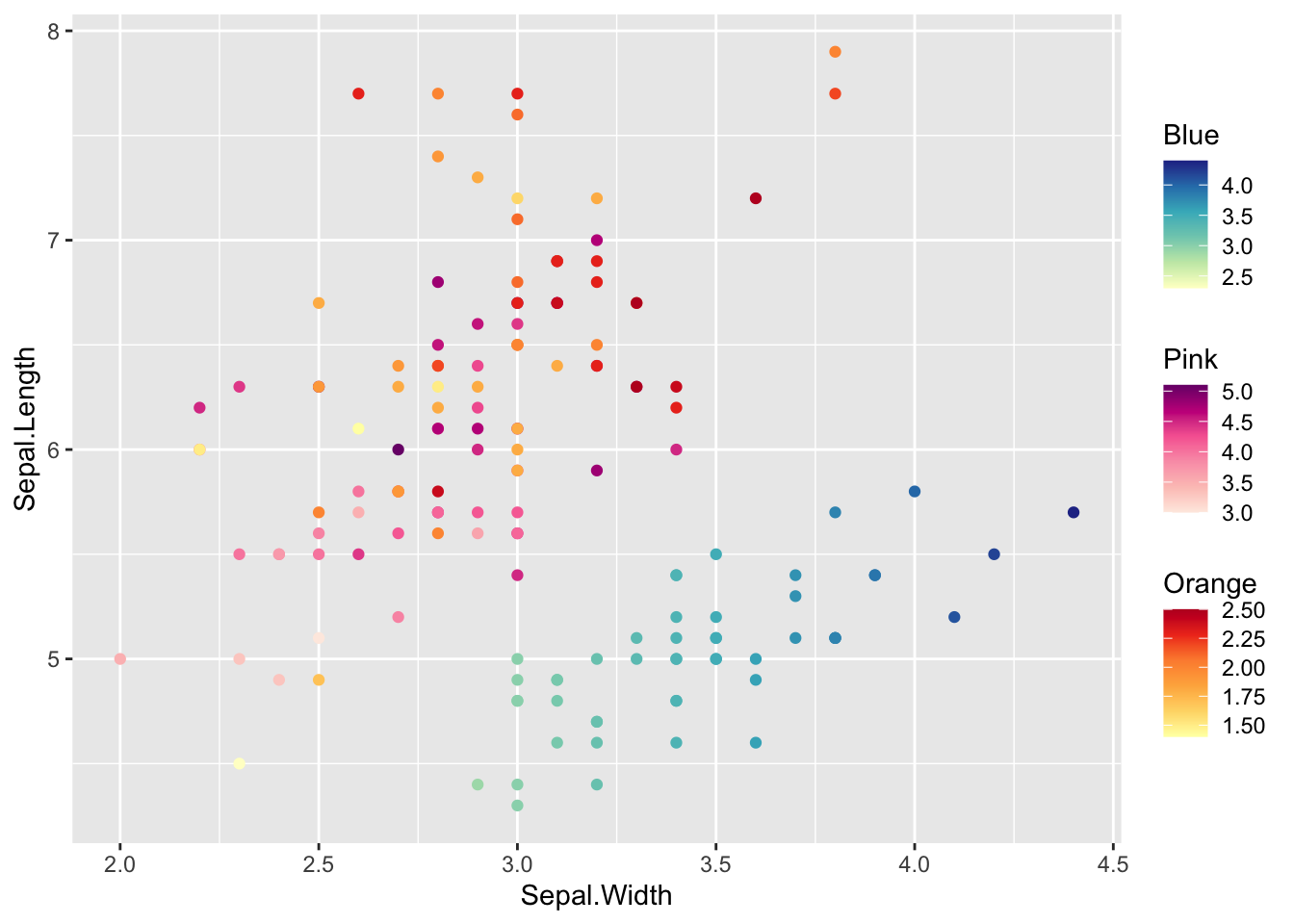
有时单一的颜色比例不足以描述数据。我之前的话用ggnewscale包来实现多种颜色scale,ggh4x提供了另一种策略。
如果数据位于不同的图层中,你可以使用 scale_colour_multi() 将多个变量映射到颜色上。它的工作原理类似于 scale_colour_gradientn(),但你可以声明美学属性,并以向量化的方式提供其他参数,与美学属性的设置平行。
在下面的示例中,给出一个包含颜色的 list(),其中第一个列表元素将成为第一个颜色比例的参数,第二个列表元素将用于第二个颜色比例,依此类推。其他只需要长度为一的参数可以作为向量输入。
 1
 2
 3
 4
 5
 6
 7
 8
 9
10
11
12
13
14
15
16
17
18
19
20
21
22
23
|
#为了绘制具有多种颜色scale的图,我们首先需要制作有具有另类aes图层
#我们将为每个物种选择一个色标。
#这将产生一些警告,因为ggplot2不知道如何处理另类aes。
g <- ggplot(iris, aes(Sepal.Width, Sepal.Length)) +
  geom_point(aes(SW = Sepal.Width),
             data = ~ subset(., Species == "setosa")) +
  geom_point(aes(PL = Petal.Length),
             data = ~ subset(., Species == "versicolor")) +
  geom_point(aes(PW = Petal.Width),
             data = ~ subset(., Species == "virginica"))

g <- g +
  scale_colour_multi(
    aesthetics = c("SW", "PL", "PW"),
    name = list("Blue", "Pink", "Orange"),
    colours = list(
      brewer_pal(palette = "YlGnBu")(6),
      brewer_pal(palette = "RdPu")(6),
      brewer_pal(palette = "YlOrRd")(6)
    ),
    guide = guide_colorbar(barheight = unit(50, "pt"))
  )
g
|
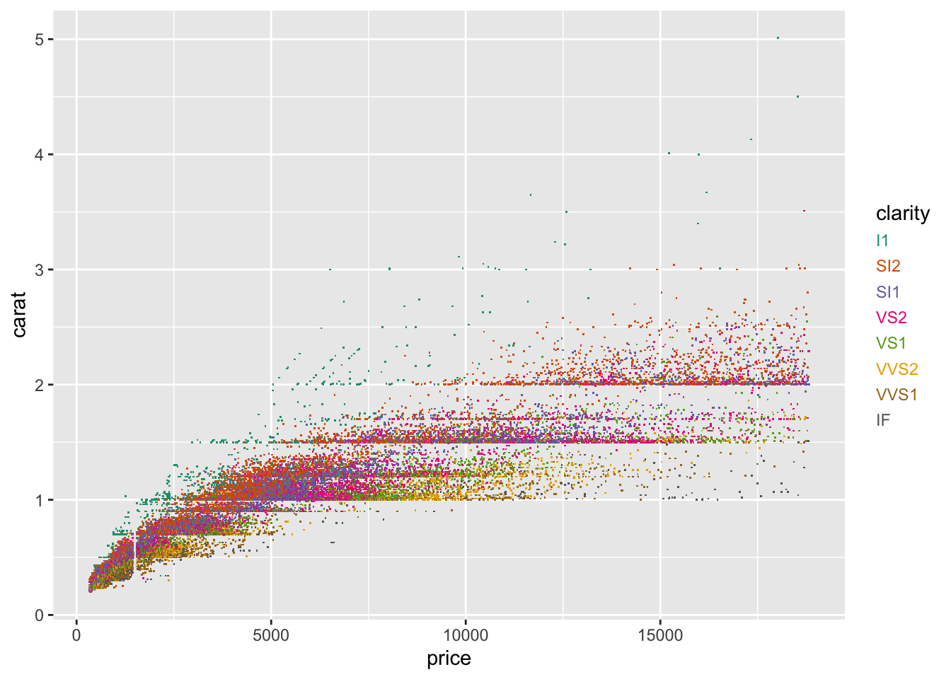
字符legend
说明颜色或填充美学的直接映射的一种简单但有效的方法是使用彩色文本。ggh4x可以通过设置guide =“stringlegend"作为颜色和填充比例的参数,或设置guides(colour ="stringlegend")来完成此操作。
1
2
3
|
ggplot(diamonds, aes(price, carat, colour = clarity)) +
  geom_point(shape = ".") +
  scale_colour_brewer(palette = "Dark2", guide = "stringlegend")
|
1
2
3
4
5
|
p <- ggplot(mpg, aes(displ, hwy)) +
  geom_point(aes(colour = class))

p + guides(colour = guide_stringlegend(spacing.x = 0, spacing.y = 5,
                                       family = "mono", ncol = 2))
|
调整坐标轴
首先,假设我们已经熟悉了坐标轴的基础设置方法,比如x,y轴(line,ticks,text)位置和主题,第二坐标轴等等:
1
2
3
4
5
6
7
8
9
|
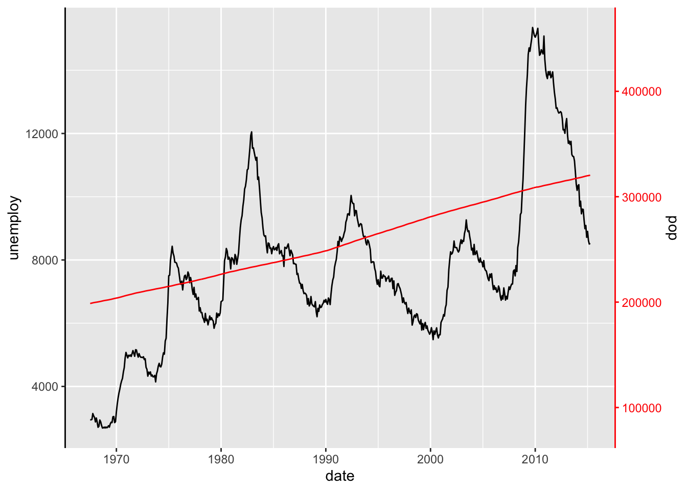
ggplot(economics, aes(date)) +
  geom_line(aes(y = unemploy)) +
  geom_line(aes(y = pop / 30), colour = "red") +
  scale_y_continuous(
    sec.axis = sec_axis(
      ~ .x * 30, name = "pop",
      guide = guide_axis_colour(colour = "red"))
  ) +
  theme(axis.line.y = element_line())
|
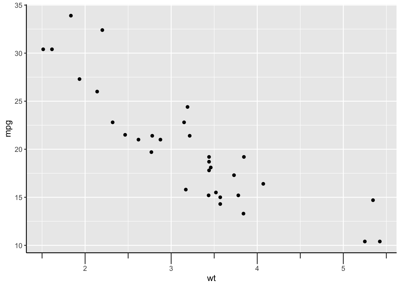
截断坐标轴
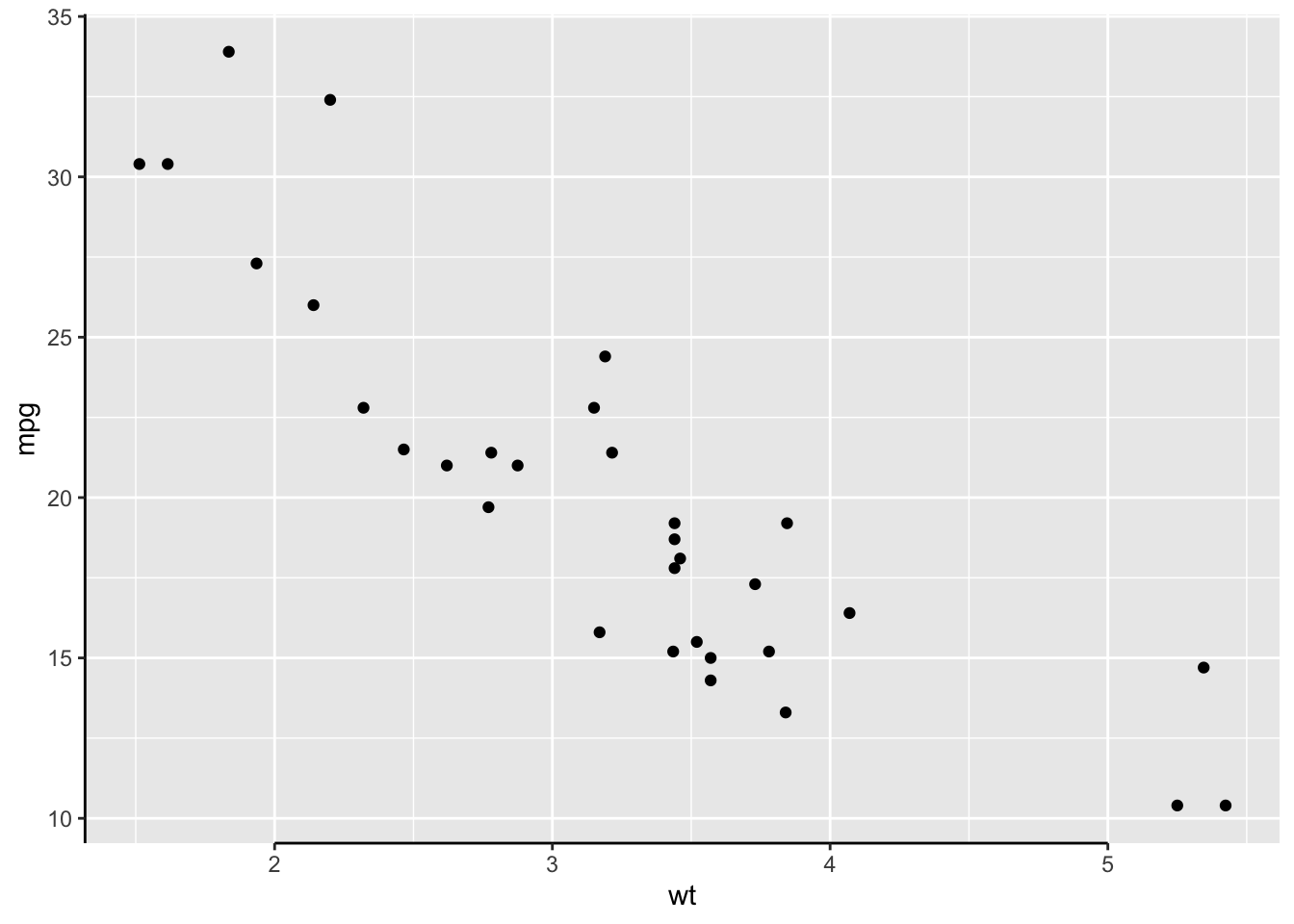
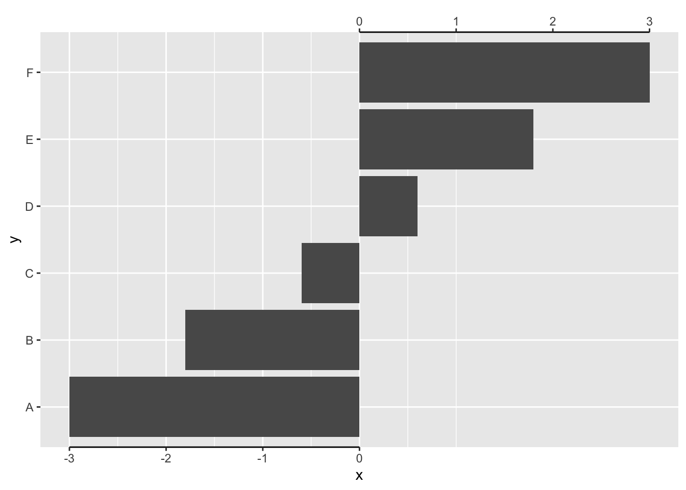
截断轴并不是一个非常特殊的轴:它只是使轴线变短。默认情况下,它将轴线修剪到最外面的断裂位置。
1
2
3
4
|
g <- ggplot(mtcars, aes(wt, mpg)) +
  geom_point() +
  theme(axis.line = element_line(colour = "black"))
g + guides(x = "axis_truncated")
|
这个可以灵活应用:
 1
 2
 3
 4
 5
 6
 7
 8
 9
10
11
|
df <- data.frame(x = seq(-3, 3, length.out = 6), y = LETTERS[1:6])

ggplot(df, aes(x, y)) +
  geom_col() +
  scale_x_continuous(
    breaks = -3:0, guide = "axis_truncated",
    sec.axis = dup_axis(
      breaks = 0:3, guide = "axis_truncated"
    )
  ) +
  theme(axis.line.x = element_line())
|
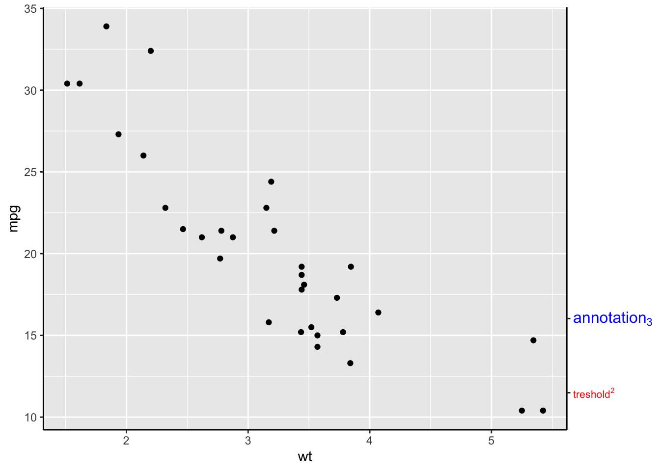
手动设置坐标轴
1
2
3
4
5
|
g + guides(y.sec = guide_axis_manual(
  breaks = unit(c(1, 3), "cm"),
  labels = expression("treshold"^2, "annotation"[3]),
  label_colour = c("red", "blue"), label_size = c(8, 12)
))
|
设置ticks
在小中断所在的位置也可以放置刻度线。
次要刻度的长度由 ggh4x.axis.ticks.length.minor 主题元素控制,并使用 rel() 函数相对于主要刻度指定。
1
2
3
|
g + guides(x = "axis_minor") +
  theme(axis.ticks.length.x = unit(0.5, "cm"),
        ggh4x.axis.ticks.length.minor = rel(0.5))
|
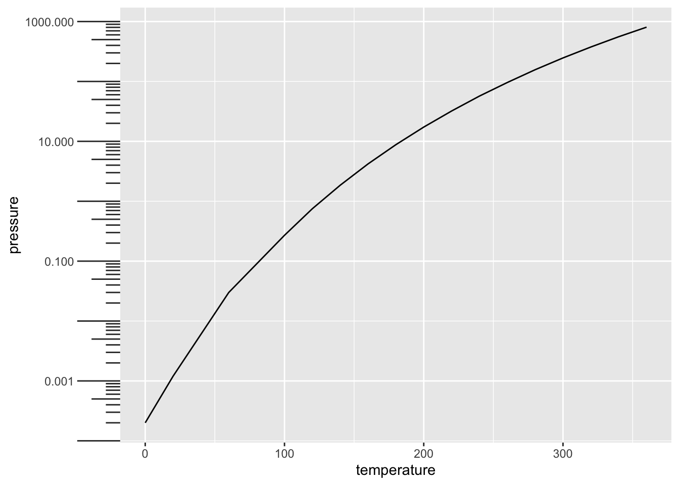
次要刻度的一个变化是为对数轴放置刻度。需要注意的是,这些在 log10 转换中效果最好。ticks现在有三种长度:主要长度、次要长度和所谓的“迷你”长度。与次要刻度一样,迷你刻度也是相对于主要刻度来定义的。
1
2
3
4
5
6
7
|
pres <- ggplot(pressure, aes(temperature, pressure)) +
  geom_line()

pres + scale_y_log10(guide = "axis_logticks") +
  theme(axis.ticks.length.y = unit(0.5, "cm"),
        ggh4x.axis.ticks.length.minor = rel(0.5),
        ggh4x.axis.ticks.length.mini = rel(0.2))
|
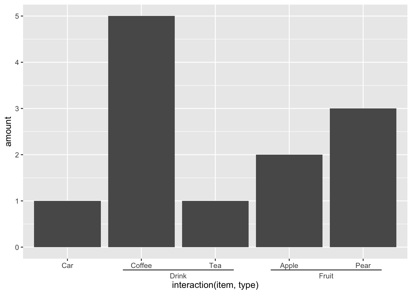
嵌套坐标轴
具有某种类别或交互作用的离散变量可以以嵌套方式布局。这可以方便地指示例如组成员身份。
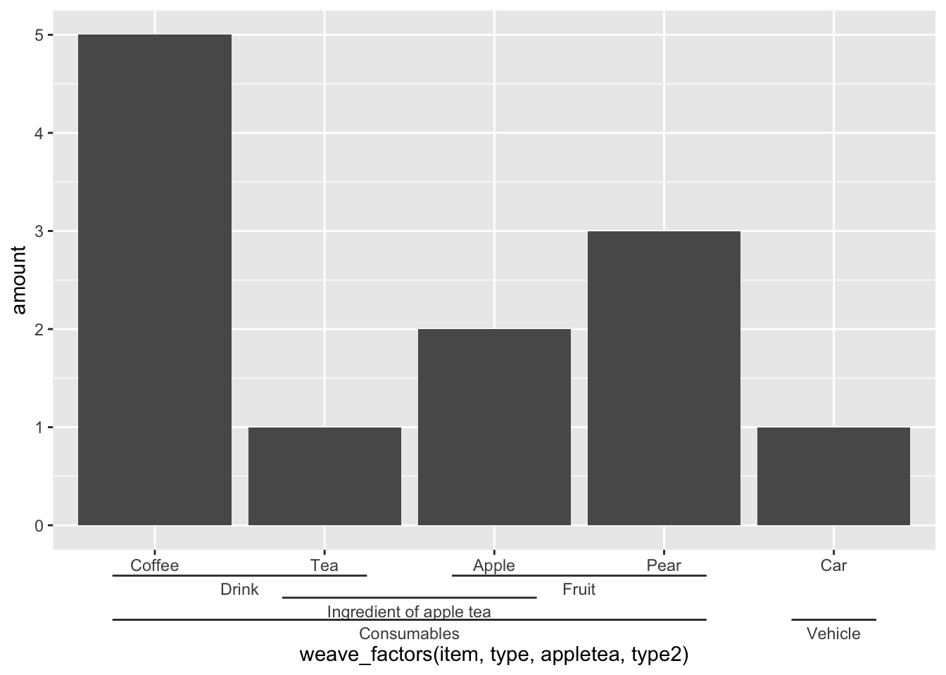
在下面的示例中,我们使用interaction()函数将项目的名称及其所属的组粘贴在一起,并使用”.“为分割。 Guide_axis_nested() 函数尝试分割“.”上的标签。用于区分项目及其组成员身份的符号。为了解决在排序项目时使用interaction() 和paste0() 带来的一些麻烦,ggh4x 提供了weave_factors() 便利函数,该函数尝试保留它们出现的因子级别的自然顺序。
 1
 2
 3
 4
 5
 6
 7
 8
 9
10
|
df <- data.frame(
  item = c("Coffee", "Tea", "Apple", "Pear", "Car"),
  type = c("Drink", "Drink", "Fruit", "Fruit", ""),
  amount = c(5, 1, 2, 3, 1),
  stringsAsFactors = FALSE
)

ggplot(df, aes(interaction(item, type), amount)) +
  geom_col() +
  guides(x = "axis_nested")
|
1
2
3
4
5
6
|
df$type2 <- c(rep("Consumables", 4), "Vehicle")
df$appletea <- c("", rep("Ingredient of apple tea", 2), rep(NA, 2))

ggplot(df, aes(weave_factors(item, type, appletea, type2), amount)) +
  geom_col() +
  guides(x = "axis_nested")
|
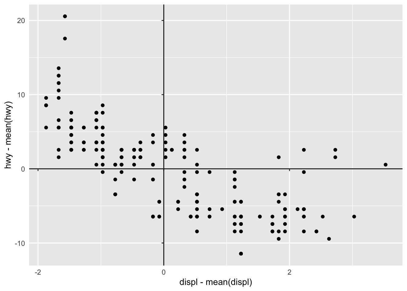
内部坐标轴
对于某些图,我们可能有兴趣让图的轴与最低限制以外的其他值相交。要将轴放置在绘图面板内,我们可以使用 coord_axes_inside()。默认情况下,如果原点不在限制范围内,coord_axes_inside() 将尝试将轴放置在原点 (0, 0) 或最接近原点的点处。
1
2
3
4
5
|
p <- ggplot(mpg, aes(displ - mean(displ), hwy - mean(hwy))) +
  geom_point() +
  theme(axis.line = element_line())

p +coord_axes_inside()
|