Introduction
R语言是平时统计分析,科研绘图的利器,除了很多非常严肃标准的可视化外,还经常可以看到一些非常有趣的绘图R包,不得不佩服开发者们的创意。
这里介绍一些我认为比较有趣的绘图R包:
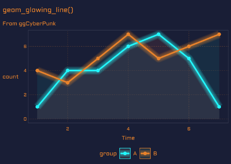
ggCyberPunk
ggplot画图也可以赛伯朋克,哈哈哈,这个包提供了非常好看的一个主题,绘制的线和面都有朦胧发光感,再加上代码风格字体。
目前只能github安装:
|
|
然后我们画一个折线图:
|
|

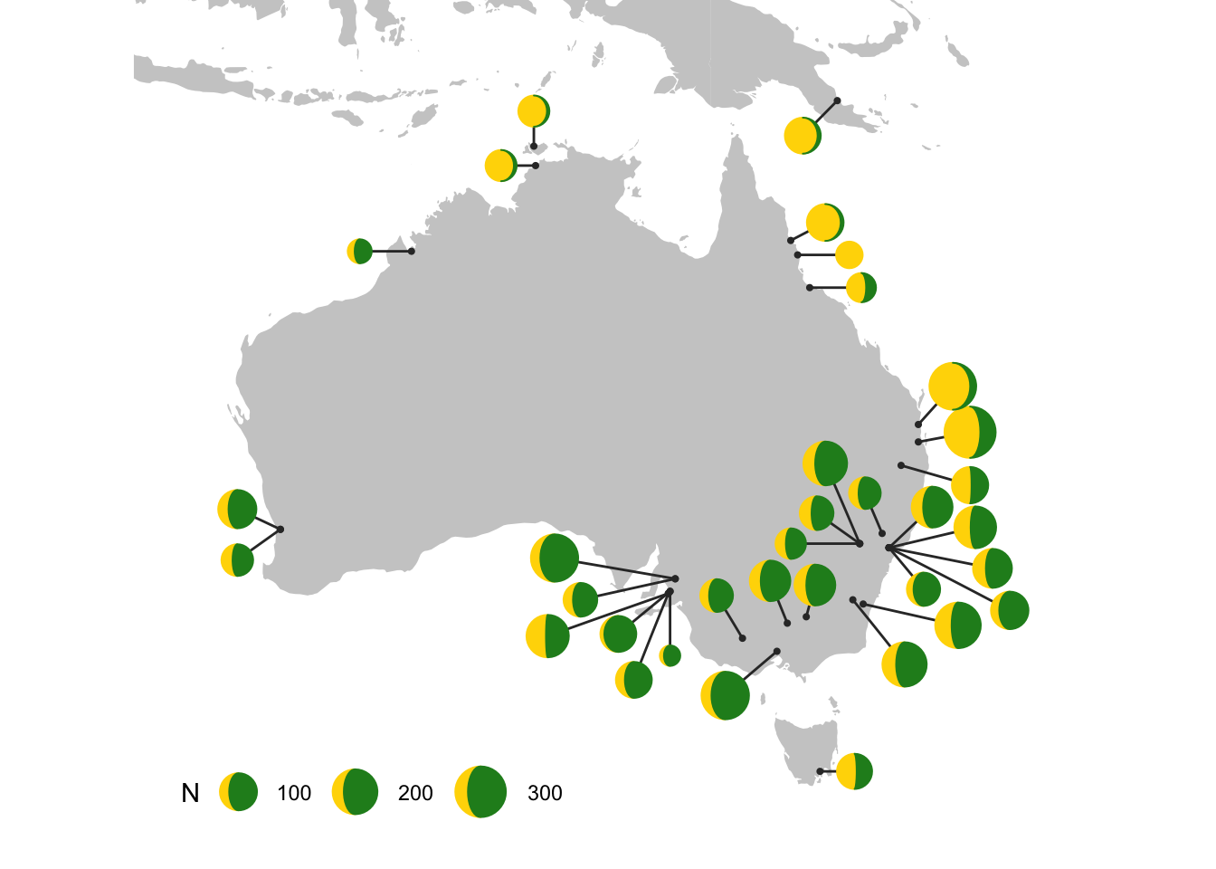
gggibbous
ggplot2的扩展包gggibbous提供了一个月亮的geom,月亮图可作为两组的饼图替代品。
|
|
使用的话,geom_moon和geome_point类似:
|
|
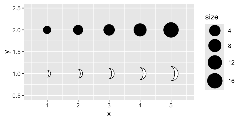
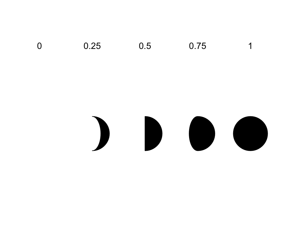
当然,它还多一些美学特征,比如ratio 控制要绘制的月亮的比例。它必须介于 0(实际未绘制任何内容的“新月”)和 1(“满月”,即圆形)之间:
|
|
right 接受一个布尔值,控制月亮是“渐盈”还是“渐亏”,即它是从右侧还是从左侧“填充”。
用两种颜色制作“完整”月亮的一种方法是对一种颜色使用 right = TRUE,对另一种颜色使用 right = FALSE,并具有互补比例。
|
|
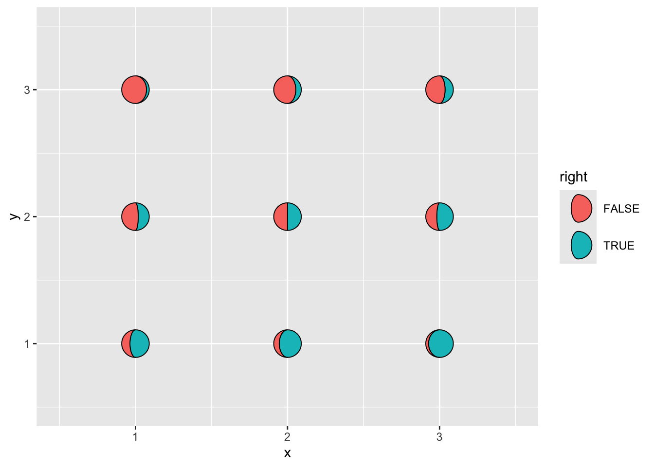
我们用moon形状绘制到地图上,展示二分组的一个情况:
|
|
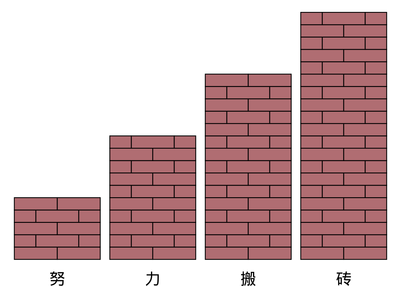
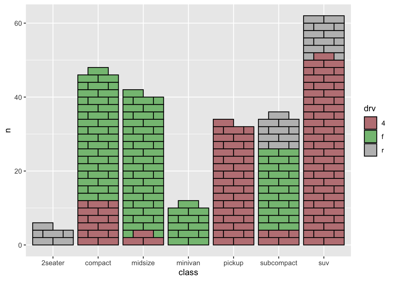
ggbrick
ggbrick提供了一个有趣的geom_brick,用来绘制砖墙或者华夫饼图:
|
|
先画一个普通的柱形图:
|
|
也可以用来画堆积柱形图:
|
|
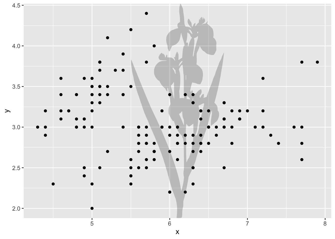
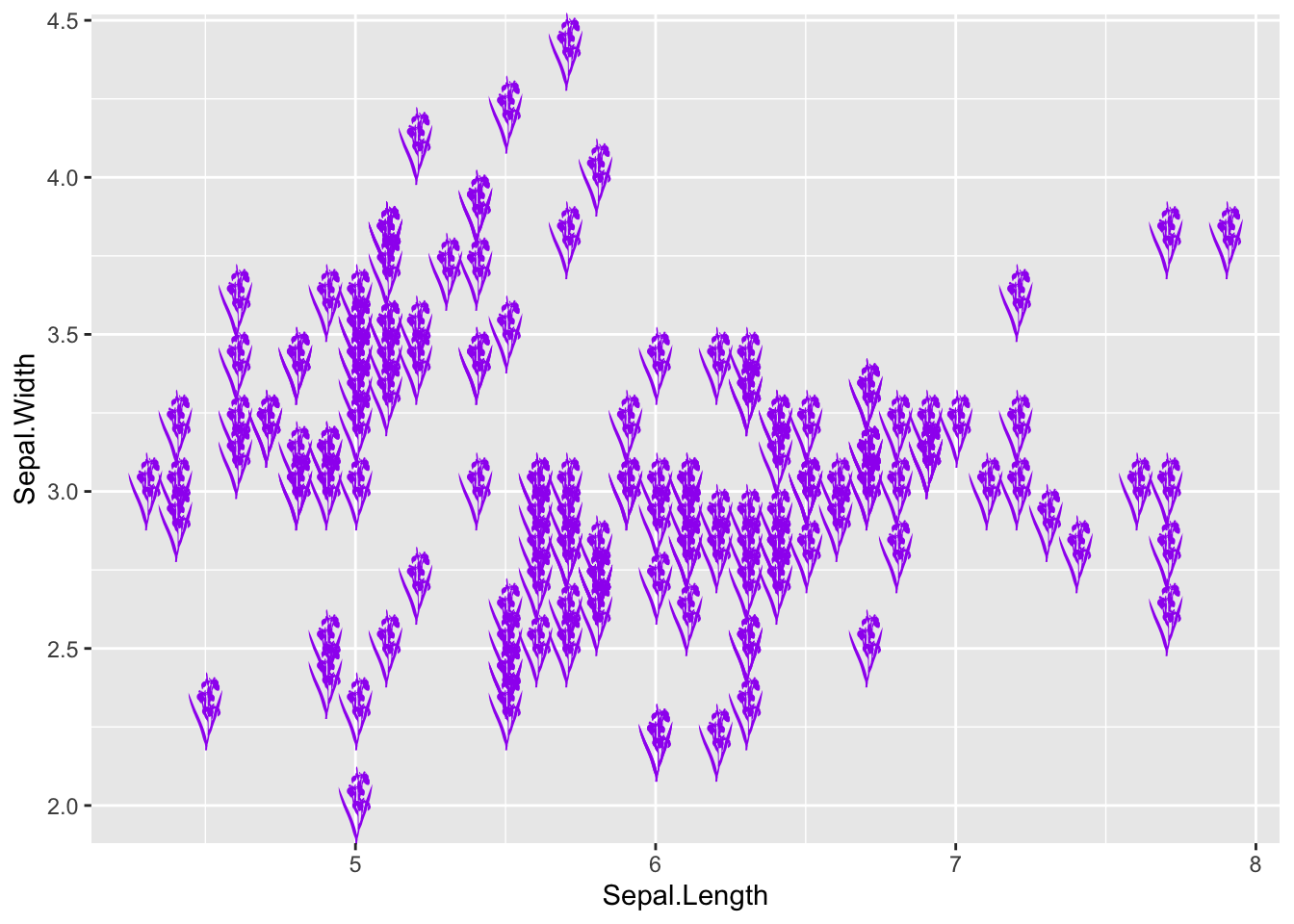
rphylopic
rphylopic 包的目的是允许用户将生物体的轮廓添加到基础 R 和 ggplot2 中生成的绘图中。为此,它使用了 PhyloPic 网站提供的剪影。
|
|
PhyloPic 网站有非常多种类的动物剪影:

rphylopic包可以查找物种学名,然后下载相应的剪影:
|
|
使用add_phylopic和geom_phylopic可以将剪影轮廓用于ggplot2:
|
|
|
|
如果你有更多有趣的R包推荐,欢迎在评论区留言。